Isabella and Chickens, Monkeys and Dancing!
Isabella made a cute video yesterday. Would you like to see it? Just click on the video link below and be prepared for some cuteness.
Little Starlet
Poor Isabella. We were trying to take a video of her making funny animal sounds. But she was so sick. She was trying her very very best to make do everything that we asked.
The video should be very cute, but we took a few photos to capture the action while we made it.
I hope you feel better soon Isabella.
Poor Orphan Babies of Vinh Long
I have been meaning to post this very sad video that I took of orphan children in Vinh Long Vietnam. The children lived in deplorable conditions and seemed to be hungry.
A sad little gift sits by each one. Something we brought for each of the babies for Christmas. The gifts seemed horribly inadequate and what the babies really needed were homes.
San Clemente is Surfers Paradise
There is no beach in California that personifies the surfer lifestyle more than San Clemente.
And can you wonder why.
I mean look at this place?
Its a dream.
Has Street Fashion Photography gotten out of control?
When Garage Magazine sought to look at trends in fashion bloggers and street style photography, they found that two trends were developing – tons of photographers were emerging to take pictures and tons of “peacocking” street style stars were emerging.
The proliferation of street style fashion blogs and photography blogs has created a huge phenomenon that everyone seemingly wants to be involved in.
I referred this post to PetaPixel and they actually put it on their site as well – PetaPixel Blog Post
Whats happening with NIK Software?
I make no secret that one of my favorite companies in the world is Nik Software, a San Diego company which makes the absolute best plug-in software for Photoshop. I use all of their products including Color Efx Pro, Silver Efx Pro, Viveza, HDR Efex Pro and in fact I have reviewed many of those products in my blog here.
In September of 2012 NIK Software was acquired by Google and lots of photographers were leery of the move. They felt that Google was going to acquire Nik and neglect the company. They felt that Google was going to take an awesome company and awesome products and basically kill it through lack of attention and investment. I was on the fence about the move but I do respect Google so I was basically maintaining a wait and see approach.
Well, its been 6 months and there has been absolutely no news out of NIK in terms of new products or upgrades. This is unusual since they used to have a steady stream of announcements and steady improvements to their software. I always looked forward to those Nik Software press releases and emails I would get about something cool they were launching. But now, crickets. Silence. Nothing new. Nothing exciting.
I guess it isn’t exactly true that there has been no news because today, Google announced that they were actually getting rid of SnapSeed for Desktop. So essentially the only news we get from NIK is about a product that Google is killing. Google has a history of starting many projects and then killing them. I don’t blame them since most of the stuff they do is for R&D purposes anyway and they keep innovating awesome stuff. What I don’t like is that Google (to date) hasn’t seemed to provide photographers any real direction of where they are headed with the NIK integration and the only news we do get is the fact that they are killing off a product. It’s a bit alarming actually.
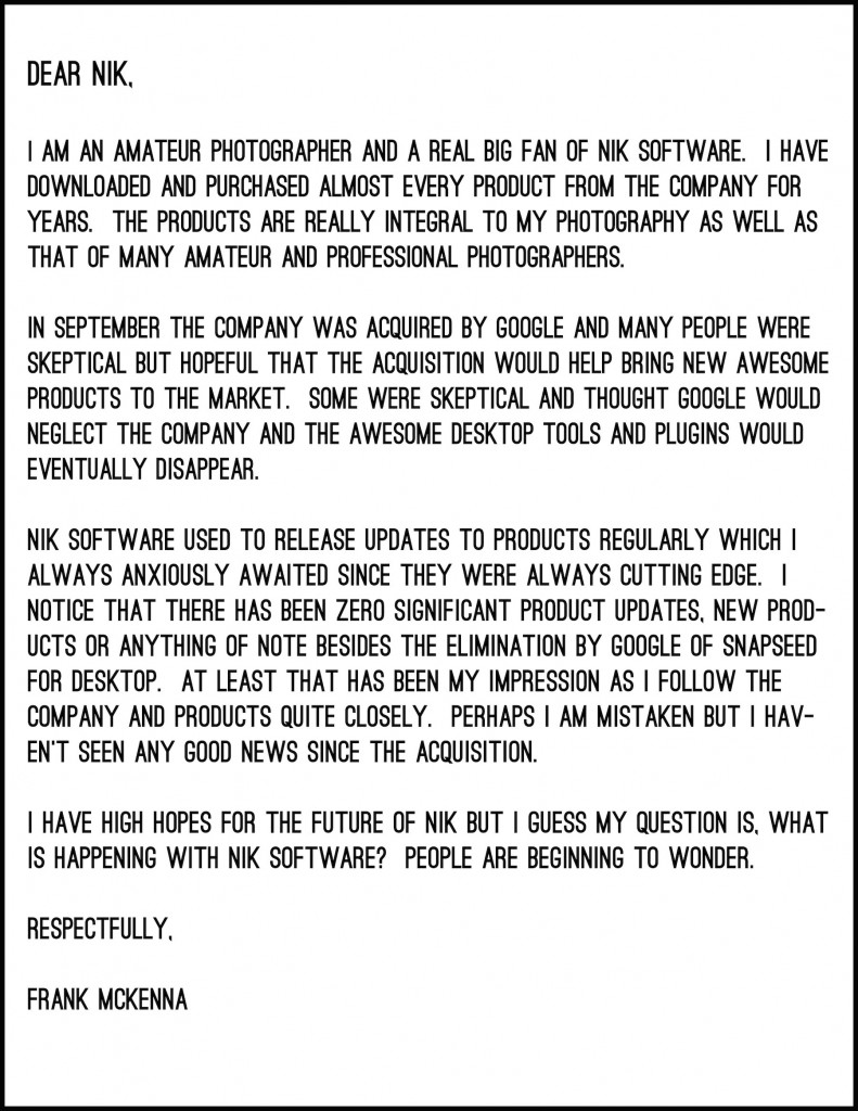
I am a little concerned with what is happening, so I sent this letter to the company today. I’ll wait and see how they respond. I am hoping for something positive but we’ll see how they respond.
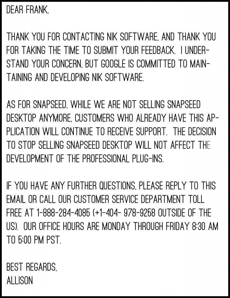
And so I did get a response. It didn’t really address the fundamental issue but rather was a form letter that they cut and paste from a script I am sure about Snapseed for Desktop. I guess the fact that the letter was addressed from Google’s Corporate office and not from San Diego where most of the legacy NIK Software team is tells me that Google does have firm control over this company now.
Well I really respect Google but I have to say based on what I am seeing so far, I wish that they had never acquired NIK and allowed that company to flourish and innovate the way they had for years. It seems a bit of a shame but I think we live in a world where big companies swallow up small companies and the result is not a better bigger company just one less good small company. I think NIK just may be an example of that.


